How we use React Context to customize our apps for our clients
Software engineer Heather Haylett explains how the Vouch UI team apply branded themes to our apps
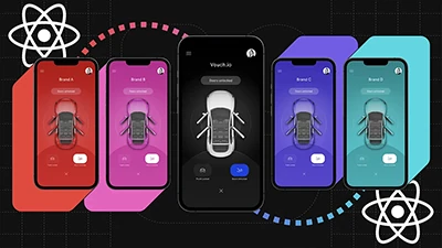
The Vouch digital identity platform creates personalized experiences for people, devices, and things. We use a Vouch branded application to showcase our platform, but typically, the client will want the application to reflect their brand. To customize our apps without duplicating code for each brand, we create a UI theme containing a company logo, brand colors, and specific features based on client needs.
Our mobile application is built with React Native and utilizes Context to create UI themes for unique client brand applications. In this post, we’ll walk through React Context and the implementation of UI theming at Vouch.
Understanding React Context
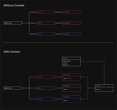
React applications use props to pass data between components. In particular use cases, an entire application needs access to the same data, and passing it manually can be a pain. To alleviate this strain, we use React Context.
The React docs put it quite simply:
[React] Context provides a way to pass data through the component tree without having to pass props down manually at every level.
In our codebase we use two React Context API method createContext and Provider plus a hook useContext:
createContextis straightforward, it creates a context object.Provideris a React component that comes with the context object. Given a value prop, descendants of the Provider use the value prop and will rerender if the prop changes.useContextis a hook that takes the context object and returns the value given to the Provider.
UI Theming
To show how we use React Context for UI theming I'll walk through a sample application that shows a basic example product, or default theme, and how we're able to switch the theme for two prospective clients, Company A and Company B.
Initial Setup
The initial step is to create a themeContex.js file and define a ThemeContext variable with the value React.createContext({}), which takes an empty object for the argument.
import React from 'react';
const ThemeContext = React.createContext({});
export default ThemeContext;
Next, we designate a style guide for each brand, assigning an object to contain brand colors and text formatting. Style guides can have different variables depending on the client’s needs. Below, the style guides for the default theme and Company A highlight the similar structure, but varying colors and text formatting.
styleGuideDefault.js
const palette = {
    brand1: "black",
    brand2: "grey",
    brand3: "white",
}
const type = {

}
export default { palette, type };
styleGuideA.js
const palette = {
    brand1: "#F9AB55",
    brand2: "#702632",
    brand3: "#283845",
    brand4: "white",
}
const type = {
    button: {
        backgroundColor: palette.brand2,
        borderColor: palette.brand3,
    },
    buttonLabel: {
        fontSize: 16,
        color: palette.brand4,
    },
    heading1: {
        fontSize: 22,
        color: palette.brand1,
    }
}
export default { palette, type };
The Provider Component
In themeProvider.js we import each style guide and the ThemeContext variable. As stated previously, the Provider is a component that comes with the context object. The component takes a value to pass down to all subsequent components. In this code, we are creating an object with properties containing values for our designated theme.
import React from 'react';
import ThemeContext from './themeContext.js';
import styleGuideA from './styleGuideA.js';
import styleGuideB from './styleGuideB.js';
import styleGuideDefault from './styleGuideDefault.js';

//Two companies: A and B
export default ({ id = '', children }) => {

    let themeStyleGuide = styleGuideDefault;

    if (id === 'A') {
        themeStyleGuide = styleGuideA;
    } else if (id === 'B') {
        themeStyleGuide = styleGuideB;
    }

    const mergedTheme = {
        themeId: id,
        features: FEATURES[id] || {showStartVehicle: true},
        styleGuide: themeStyleGuide,
    };

    return <ThemeContext.Provider value={mergedTheme}>{children}</ThemeContext.Provider>;
};
const FEATURES = {
    B: {
        showStartVehicle: false,
    },
};
Let’s explore the variable assignments in this file:
themeStyleGuide:the style guide dictated by the argumentid, default style guide if no id provided.mergedTheme:an object with propertiesthemeId, features (if present), andstyleGuide.
We return the component passing the variable mergedTheme to the value prop of Provider, which provides a theme for the entire application.
Finally, in App.js, our main component, we import the ThemeProvider component and wrap it around the LandingPagecomponent. Now the landing page has access to a theme simply by passing in a value to the id prop of ThemeProvider.
import React from 'react';
import LandingPage from './src/landingPage/landingPage.js';
import ThemeProvider from './theme/themeProvider.js';
const App = () => {
  return (
    <ThemeProvider id=''>
      <LandingPage />
    </ThemeProvider>
  );
};
export default App;
useContext Hook
The Landing Page file has inline styling and renders features dynamically based on the theme. To access client specifications from ThemeProvider, we have the useContext hook.
useContext takes themeContext (imported at the top of the file from themeContext.js) as an argument and returns the same object that we pass to the Provider value prop in themeProvider.js. This allows us to destructure the object and use the properties as we need.
For example, we can use themeId to determine which logo to display on the Landing Page or use styleGuide for inline styling.
import React, { useContext } from 'react';
import { Image, Text, View } from 'react-native';
import Button from '../button/button.js';
import ThemeContext from '../../theme/themeContext.js';

const LandingPage = () => {
    const { styleGuide: { palette, type }, features: { showStartVehicle }, themeId } = useContext(ThemeContext);
    const logoImage = {
        A: <Image style={ {margin: 20} } source={require('../assets/companyA_logo.png')}/>,
        B: <Image style={ {margin: 20} } source={require('../assets/companyB_logo.png')}/>,
    }
    const backgroundColor = {
      A: palette.brand1,
      B: palette.brand2,
    }
    return (
        <View style={ {alignItems: 'center', justifyContent: 'center', flex: 1, backgroundColor: backgroundColor[themeId]} }>
            <Text style={type.heading1}>Welcome to Digital Key</Text>
                {logoImage[themeId] || <Image style={ {margin: 50} } source={require('../assets/vouch_logo.png')}/>}
                <Button title="View Vehicle"/>
                {showStartVehicle && <Button title="Start Vehicle"/>}
        </View>
    )
};
export default LandingPage;
Theme in Action
Watch the Landing Page screen change theme from default to Company A or Company B.
Find the complete Github repository for the code shown here.